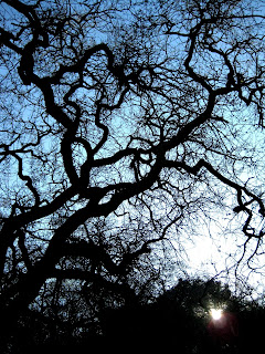
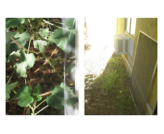
So I turned in my final images for the project today. I also got Photoshop CS4 and Bridge CS4 on my laptop now (Thanks Arielle!) so I can actually use it in class. I'm excited that I can finally use my Macbook as my main photography computer! Alright so I went with one of the pictures from the last post, then decided to try something else with the second that I turned in. Let me know what you think, or just wait until the critique...
With the second picture it's two separate pictures, and by itself I don't even like the picture on the right, but when paired with the other one it somehow works for me. I know the background is completely blown out, but I like how it kind of just blends into the borders of the pictures.


Oh wow that diptych looks fantastic! I love the use of light in all of these. Nice job.
ReplyDeleteThe diptych does look really interesting, Steve. I just wish I could see it bigger. Please fix. Please.
ReplyDelete